
Transformation should feel guided, not forced.
KarmaNova Mindful Body Transformation
KarmaNova is a wellness brand strategy and identity project built around personalized transformation, behavior change, and self-trust. The work included brand foundation, messaging strategy, visual identity, print collateral, and a 90-day social content system designed to help the brand communicate with clarity and emotional intelligence.
Role:
Brand Strategy / Identity System / Messaging / Social Content System / Print Collateral
Client: KarmaNova
Industry: Wellness / Lifestyle Coaching
Scope: Strategy, identity, messaging, social, print collateral
Timeline: 2026

Personalized transformation built around your inner universe.
The central strategy for KarmaNova was built around the idea that transformation is not a fixed program. It is a personal system shaped by mindset, nutrition, movement, habits, emotional regulation, and self-trust.
The brand needed to feel structured enough to be credible, but personal enough to avoid the cold, one-size-fits-all tone common in wellness marketing.
The wellness category has a trust problem.
Many wellness brands rely on pressure, extremes, before-and-after logic, and generic motivation. KarmaNova needed a different position. The brand had to communicate transformation without shame, expertise without fear tactics, and structure without making the audience feel controlled.
The challenge was to build a system that could help people feel understood before asking them to change.
Building the foundation before the visuals.
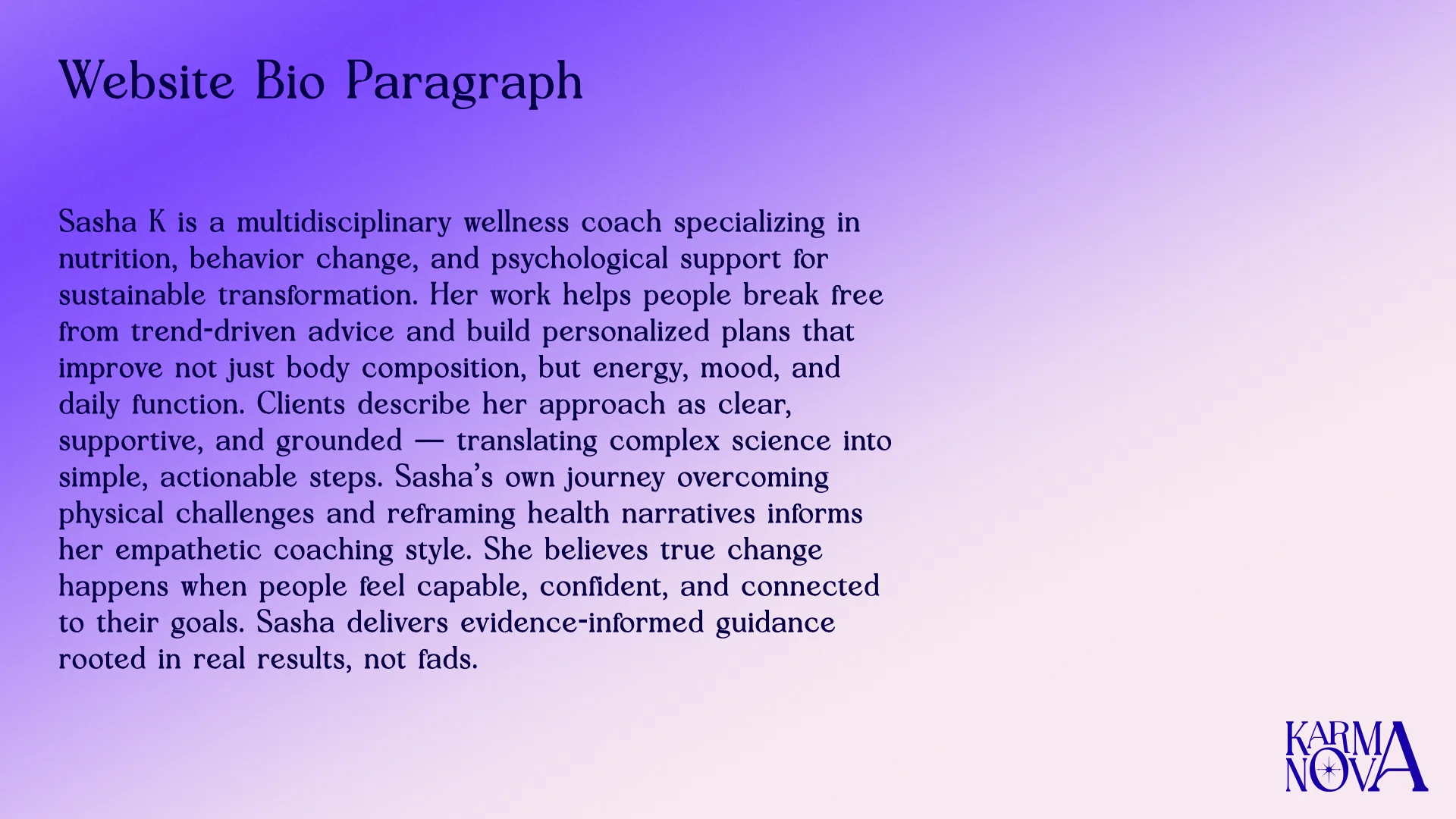
Before designing the identity system, I developed the strategic foundation for how KarmaNova should sound, behave, and build trust. The brand needed a clear internal logic: what it believes, who it serves, what transformation means, and how it should guide people without relying on pressure.
Emotional Strategy
Essence
Personalized Transformation Built Around Your Inner Universe.
Positioning
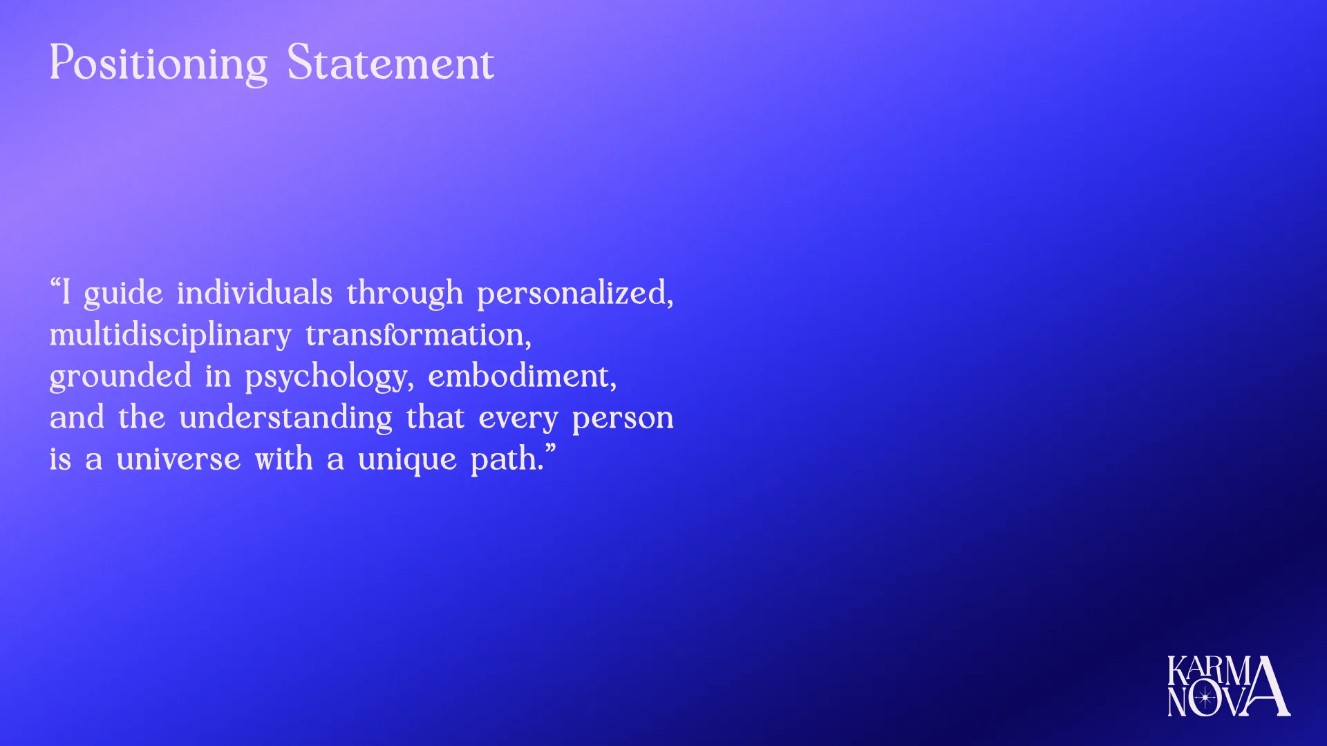
A mindful body transformation brand helping people build sustainable change through personalized coaching, behavior awareness, and self-trust.
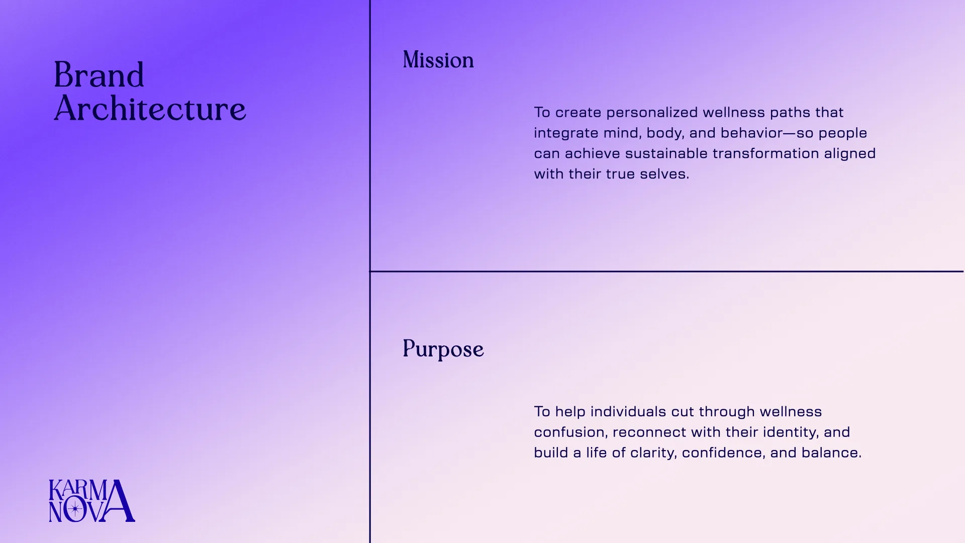
Mission
To help people reconnect with their bodies, rebuild trust, and create transformation that fits their real life.
Purpose
To make growth feel less like control and more like alignment.
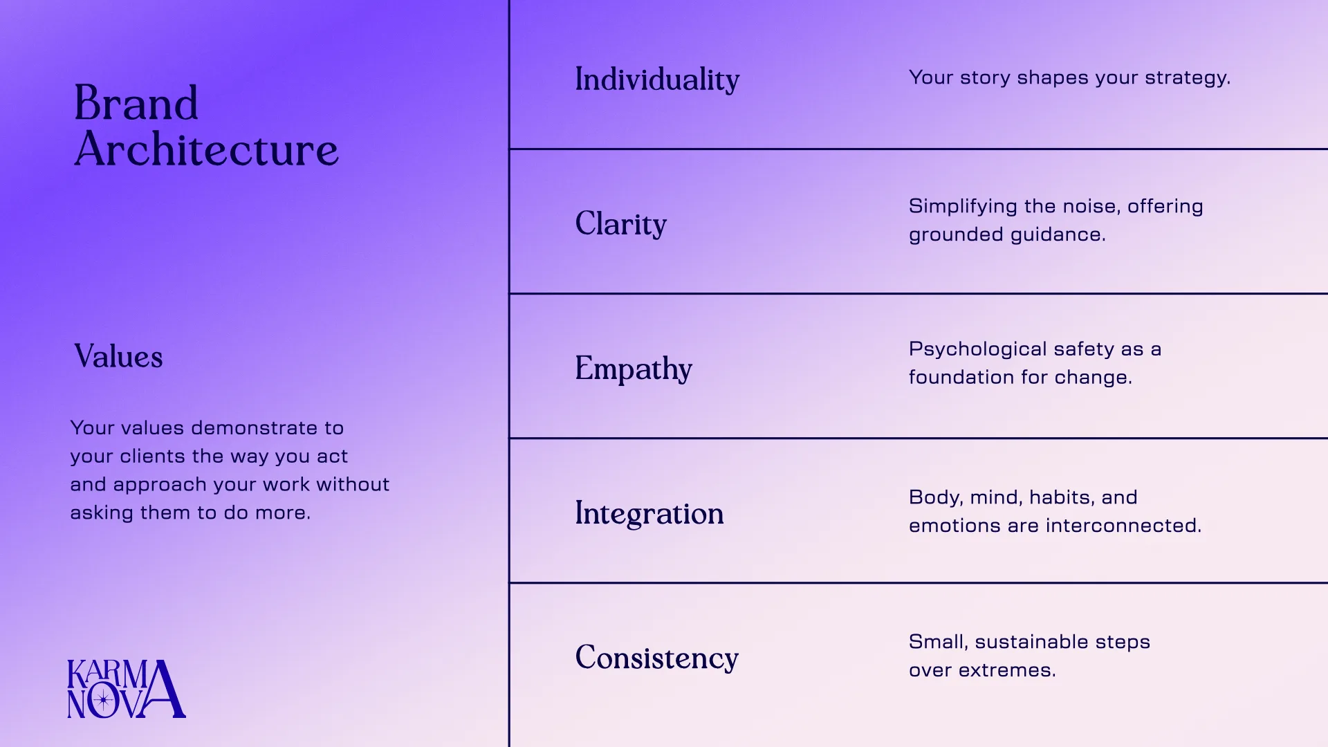
Values
Self-trust, sustainability, personalization, compassion, evidence, integration.
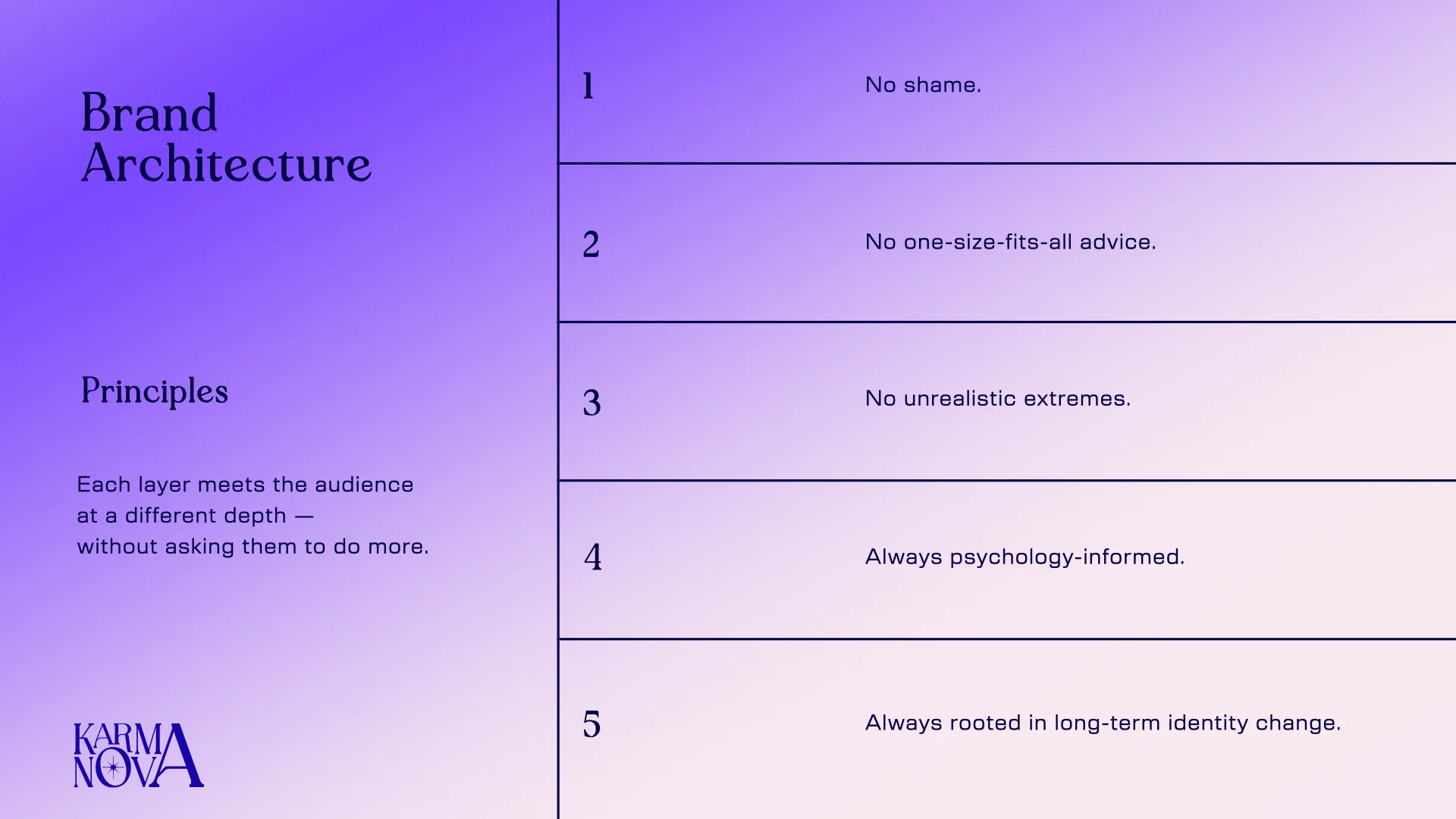
Principles
Listen before forcing. Build from the body. Make change livable. Let consistency become flexible.
Messaging built around mindset, not just demographics.
The audience strategy focused on readiness, fear, motivation, and trust. Instead of treating the audience as one broad wellness consumer, I organized the messaging around three mindsets that would need different forms of reassurance, proof, and invitation.

The Overextended Achiever
What they fear:
Falling behind, losing control, failing again.
What they need:
Structure, permission to slow down, and proof that consistency can be flexible.
Message:
Progress does not require punishment.
Content that earns trust:
Reframes around burnout, pace, adaptation, and sustainable effort.
Content Hook:
“Train for your next decade”
“Strength, energy, and clarity — without extremes”

The Wellness Skeptic
What they fear:
Being sold another empty promise.
What they need:
Evidence, direct language, and a brand that does not overclaim.
Message:
Transformation should be personal, not performative.
Content that earns trust:
Myth-busting, grounded education, and clear explanations.
Content Hook:
“Why the same plan hurts different bodies”
“Personalization beats hacks”

The Rebuilding Self
What they fear:
Starting over, not trusting their body, not knowing what works.
What they need:
Small wins, emotional safety, and guided practice.
Message:
Your body is giving information, not failure.
Content that earns trust:
Gentle practices, reflection prompts, and nervous-system-aware guidance.
Content Hook:
“Your body isn’t broken — the advice is”
“Build confidence from the inside out”
A visual system for inner alignment.
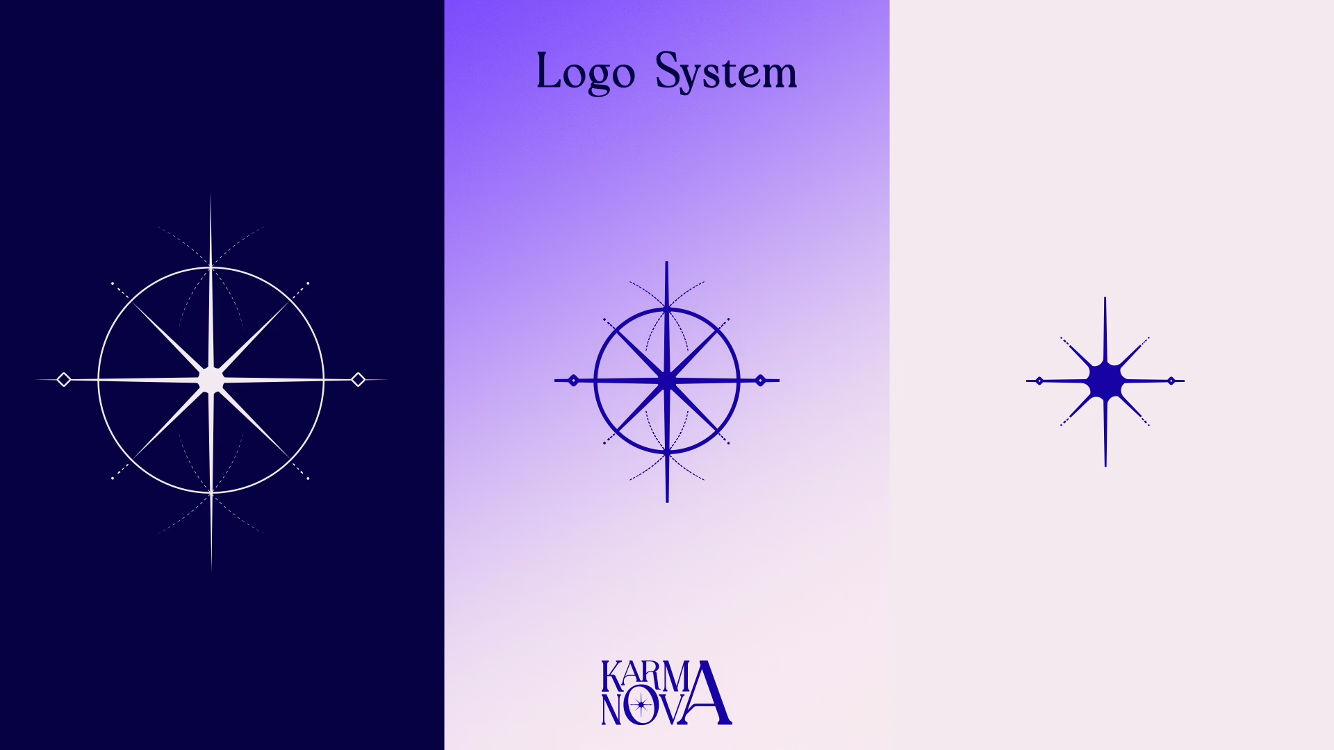
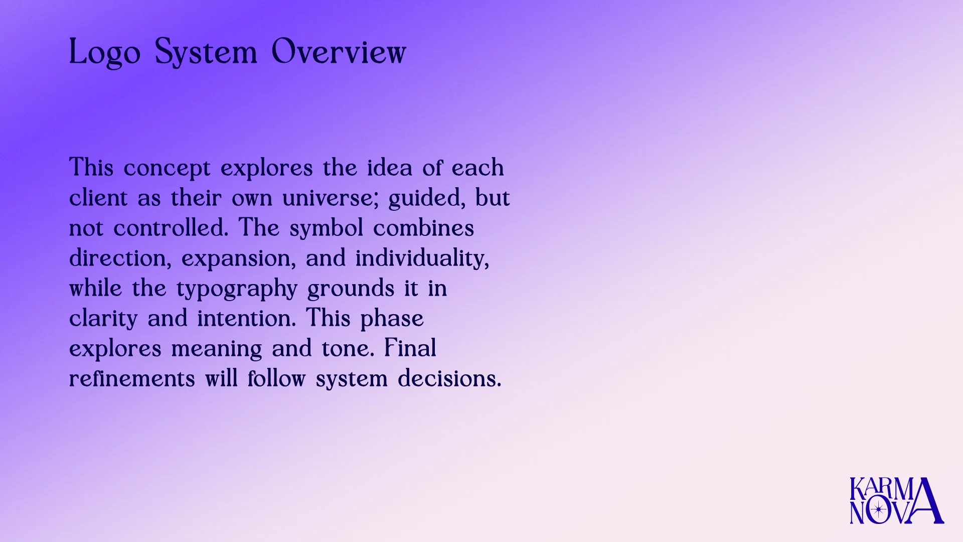
The identity system was designed to feel reflective, personal, and structured. The visual language uses cosmic, emotional, and body-centered cues to express the idea of an inner universe: transformation as something guided from within, not imposed from the outside.
The logo system needed to feel elevated enough for a coaching brand, but warm enough to support vulnerable conversations around wellness, behavior, and change.
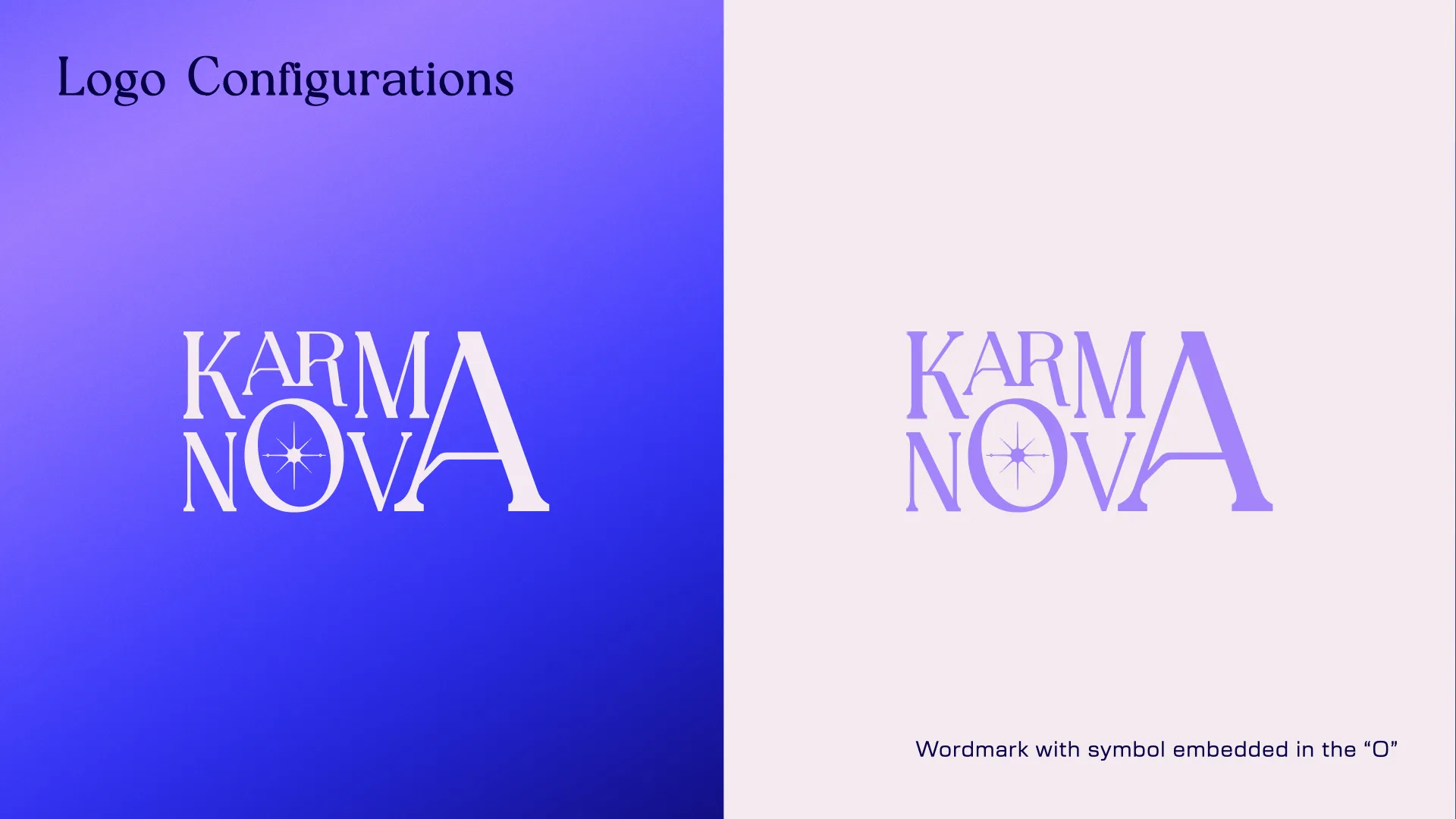
Primary logo



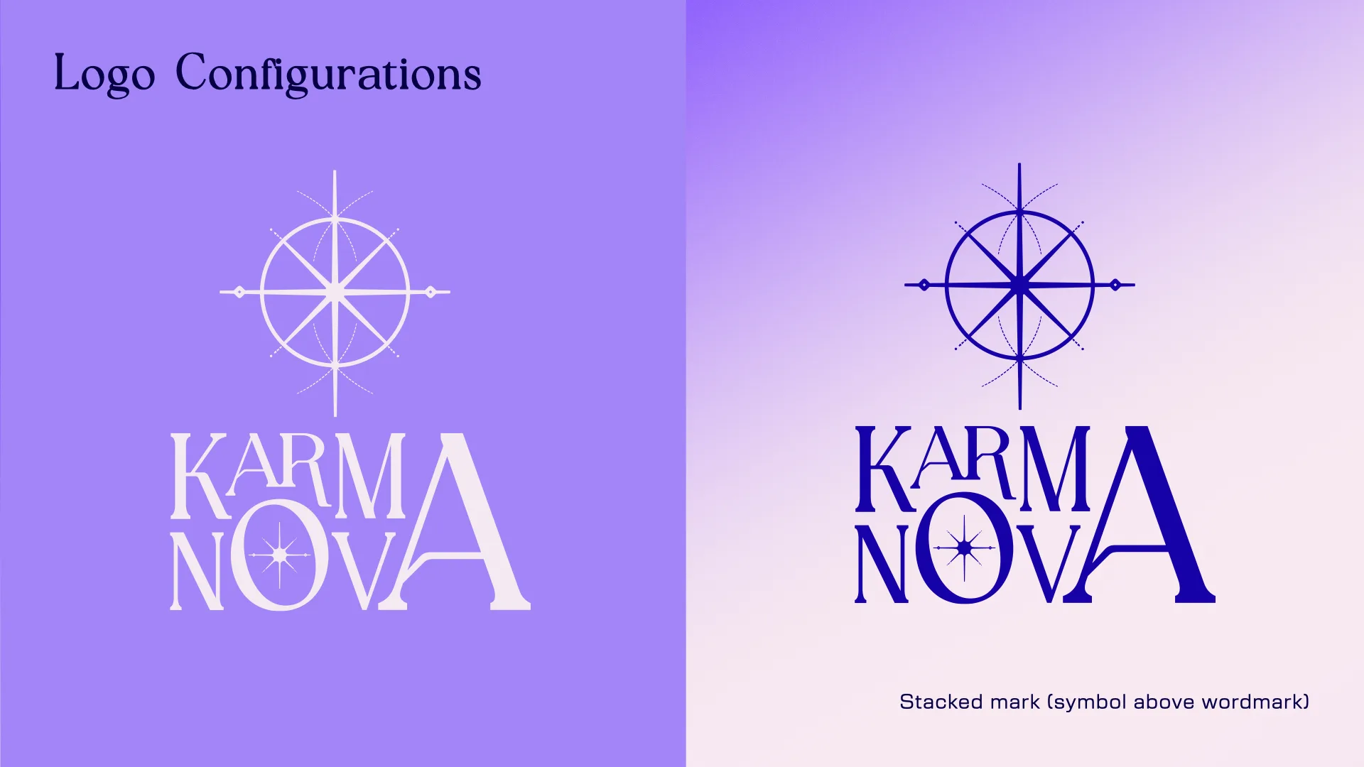
Secondary logo


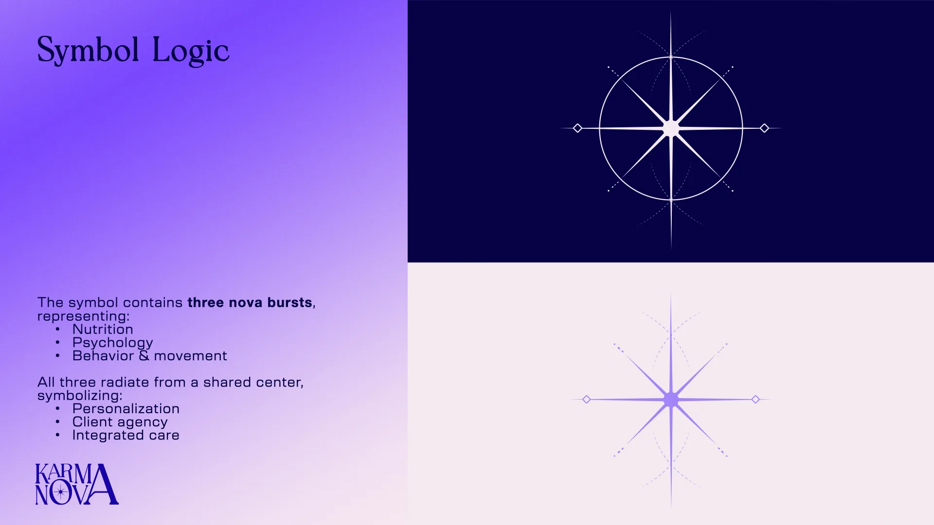
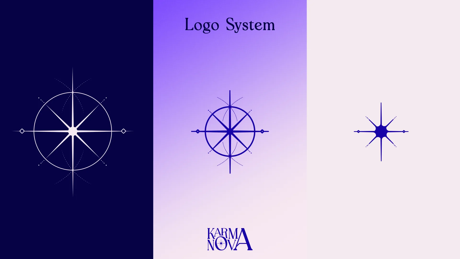
Symbol






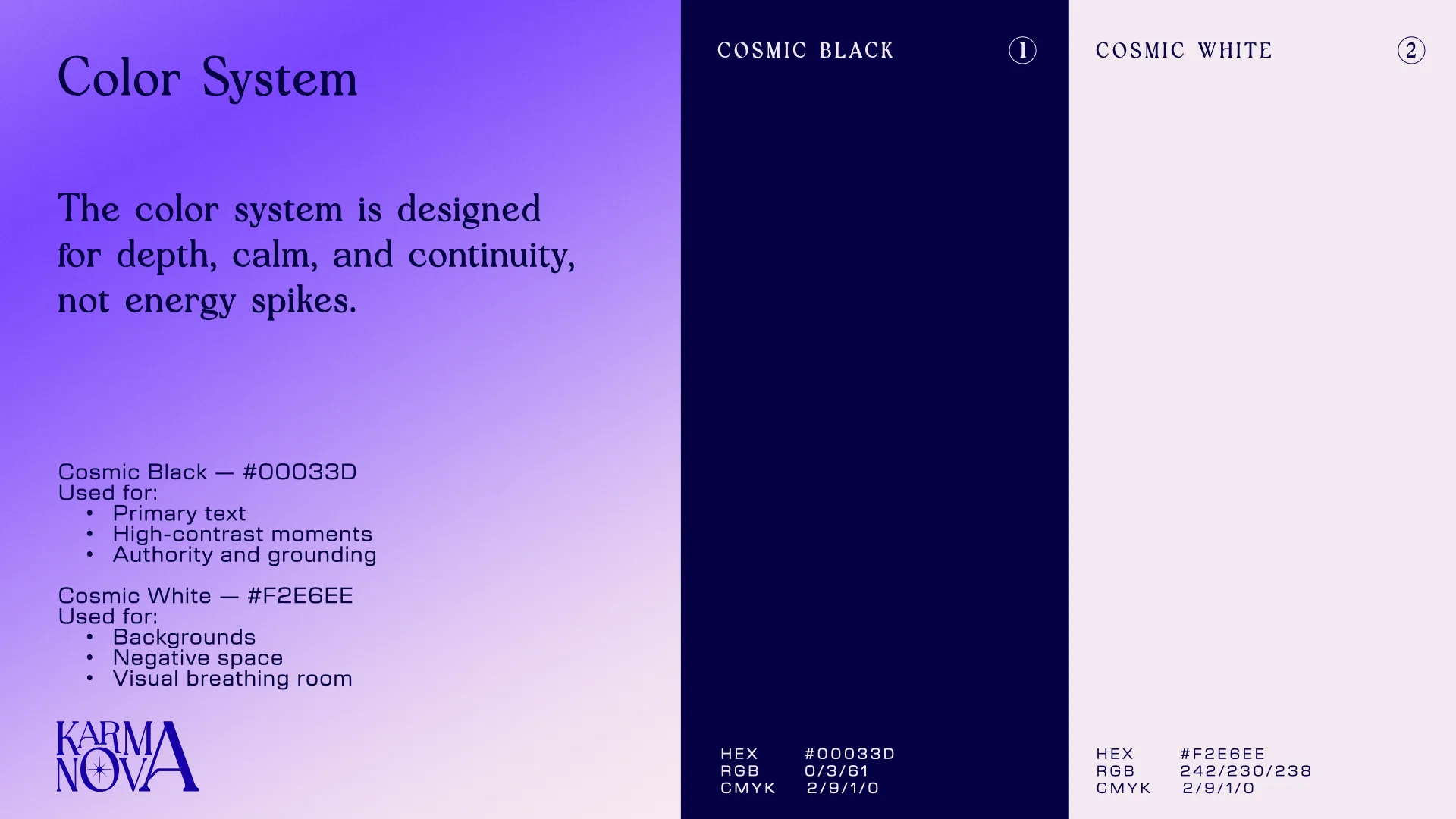
Color System
The color system is designed for depth, calm, and continuity, not energy spikes.
Cosmic Black — #00033
Used for:
•Primary text
•High-contrast moments
•Authority and grounding
Cosmic White — #F2E6EE
Used for:
•Backgrounds
•Negative space
•Visual breathing room
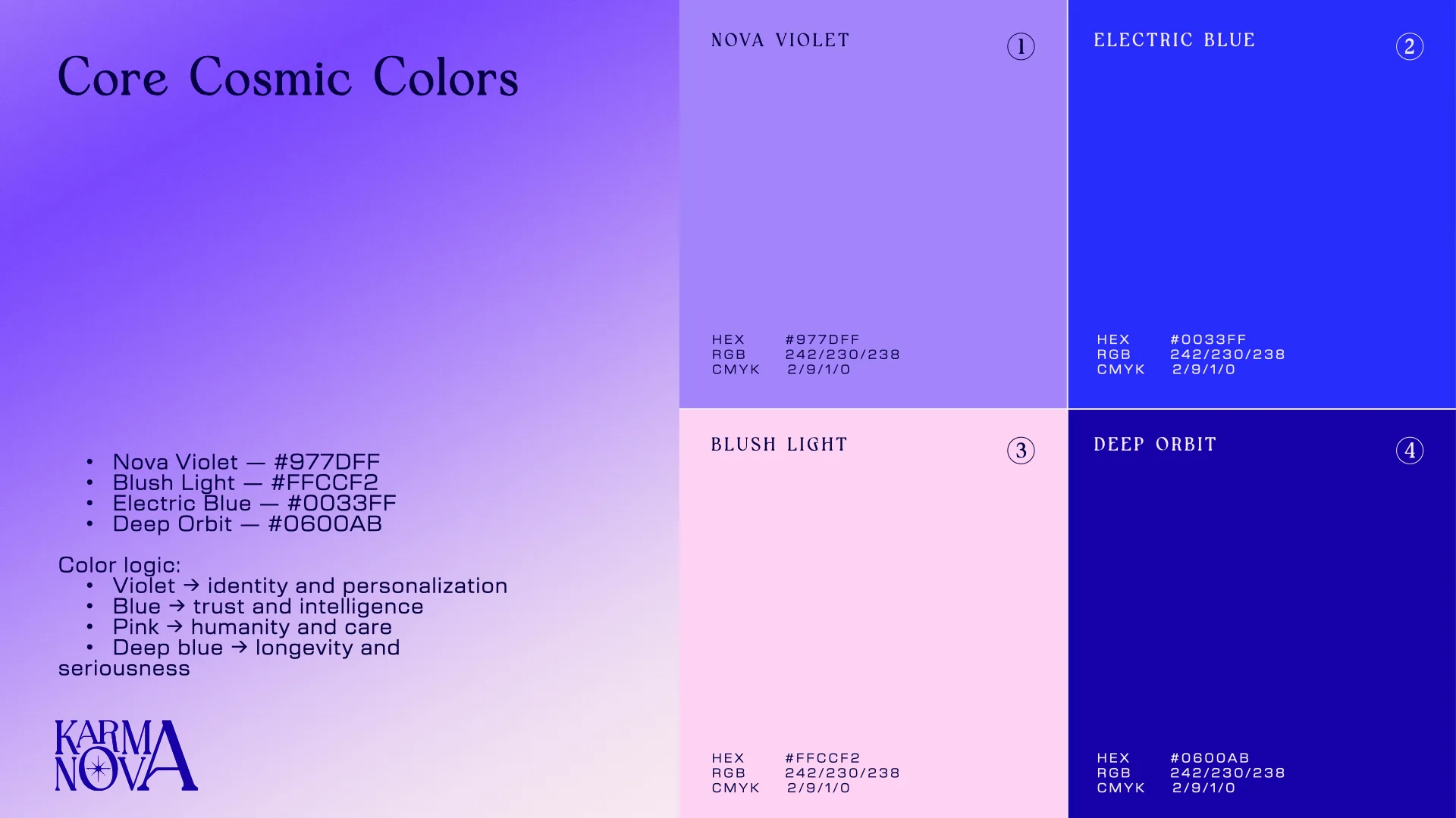
Core Cosmic Colors
•Nova Violet — #977DFF
•Blush Light — #FFCCF2
•Electric Blue — #0033FF
•Deep Orbit — #0600AB
Color logic:
•Violet → identity and personalization
•Blue → trust and intelligence
•Pink → humanity and care
•Deep blue → longevity and seriousness
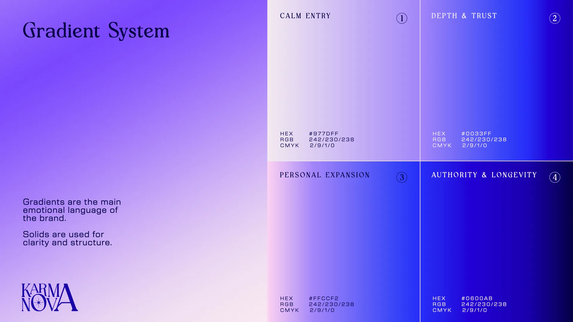
Gradient System
Gradients are the main emotional language of the brand.
Solids are used for clarity and structure.
•Calm Entry — (Cosmic White to Nova Violet)
•Depth & Trust— (Nova Violet to Electric Blue)
•Personal Expansion — (Blush Light to Electric Blue)
•Authority & Longevity — ( Electric Blue to Cosmic Black)
Typography System
The type system balances emotional authority, scientific clarity, and functional restraint.
Each typeface has a defined role to prevent visual noise and over-design.
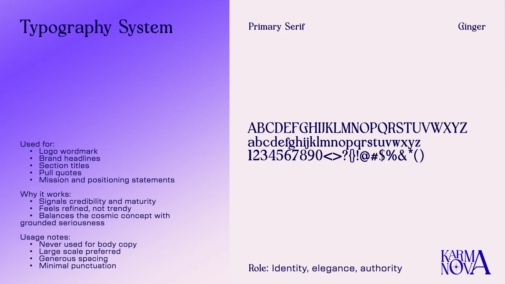
Primary Serif - Ginger Role: Identity, elegance, authority
Used for:
•Logo wordmark
•Brand headlines
•Section titles
•Pull quotes
•Mission and positioning statements
Why it works:
•Signals credibility and maturity
•Feels refined, not trendy
•Balances the cosmic concept with grounded seriousness
Usage notes:
•Never used for body copy
•Large scale preferred
•Generous spacing
•Minimal punctuation
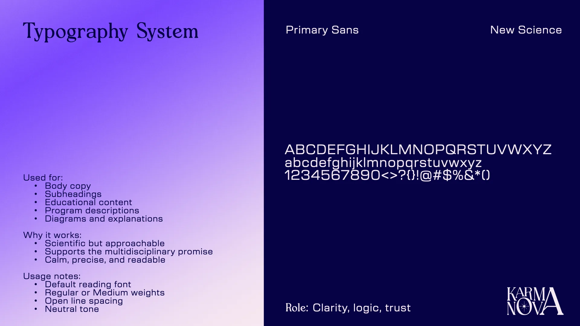
Primary Sans - New Science Role: Clarity, logic, trust
Used for:
•Body copy
•Subheadings
•Educational content
•Program descriptions
•Diagrams and explanations
Why it works:
•Scientific but approachable
•Supports the multidisciplinary promise
•Calm, precise, and readable
Usage notes:
•Default reading font
•Regular or Medium weights
•Open line spacing
•Neutral tone
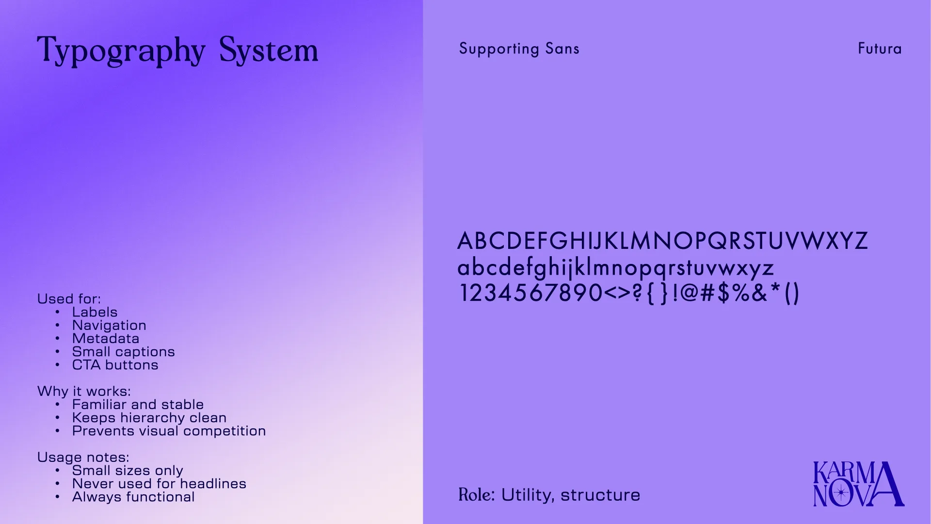
Supporting Sans - Futura Role: Utility, structure
Used for:
•Labels
•Navigation
•Metadata
•Small captions
•CTA buttons
Why it works:
•Familiar and stable
•Keeps hierarchy clean
•Prevents visual competition
Usage notes:
•Small sizes only
•Never used for headlines
•Always functional

Client-ready collateral
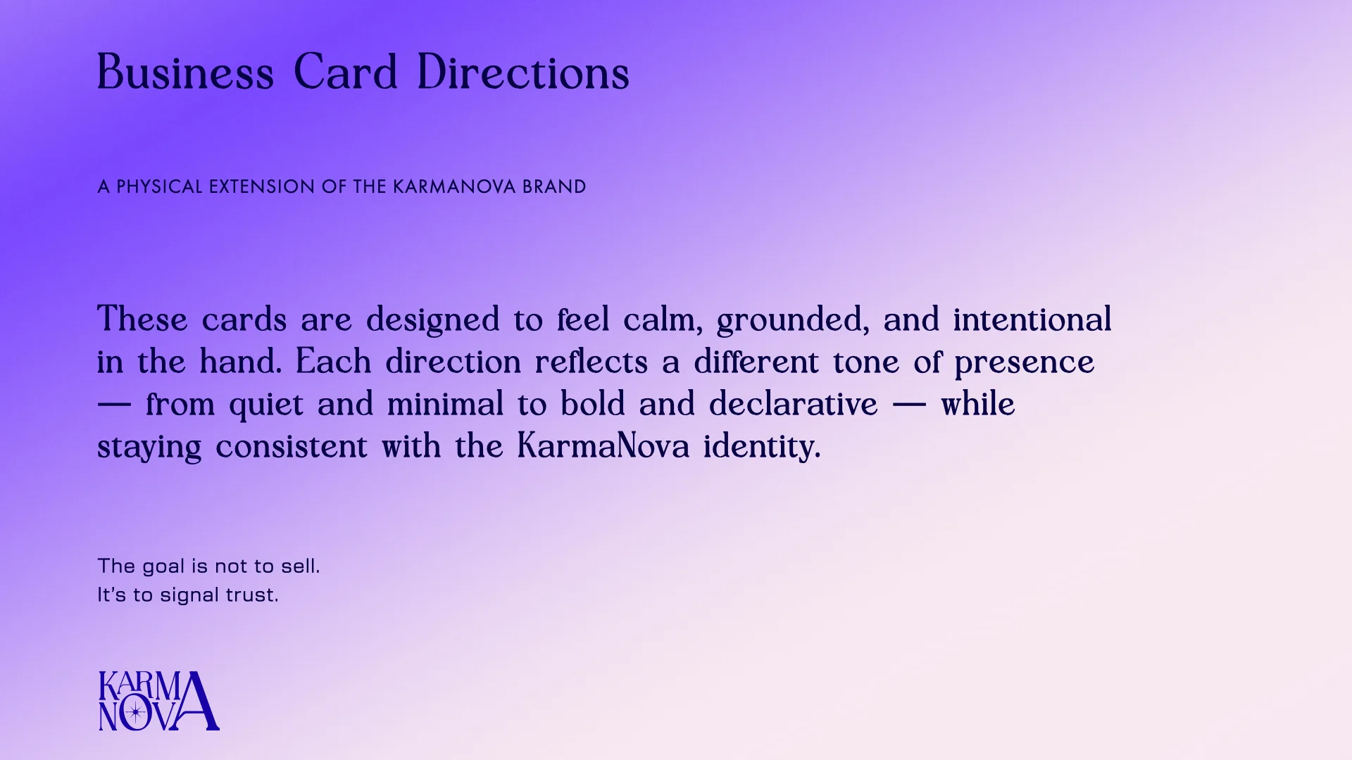
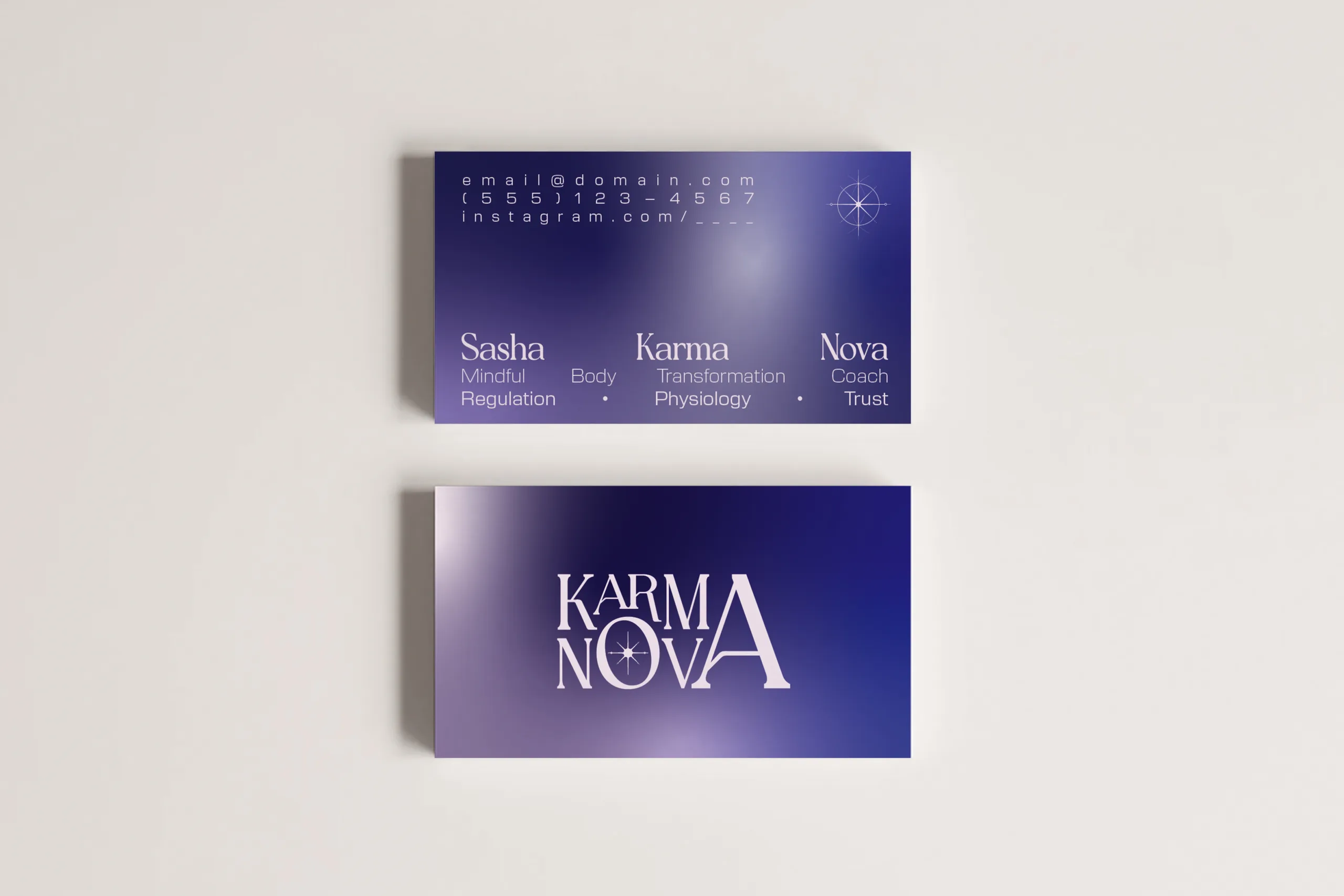
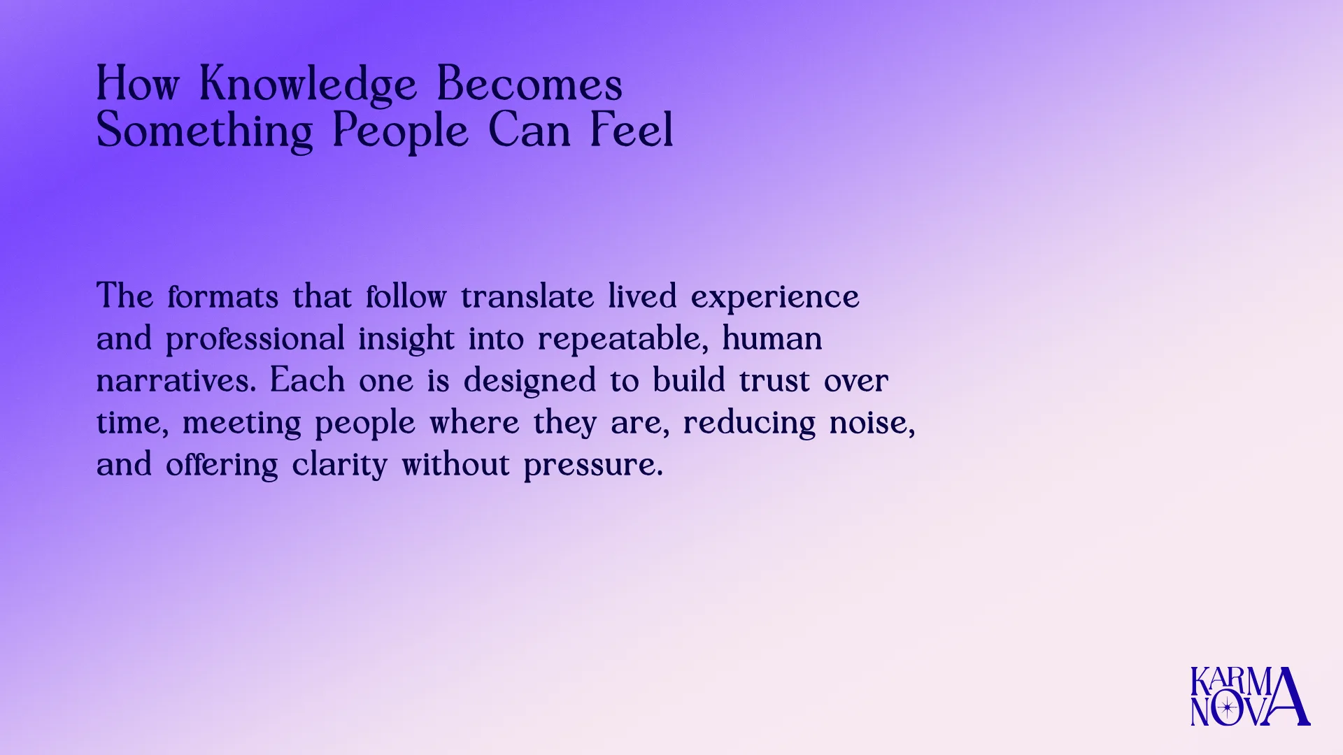
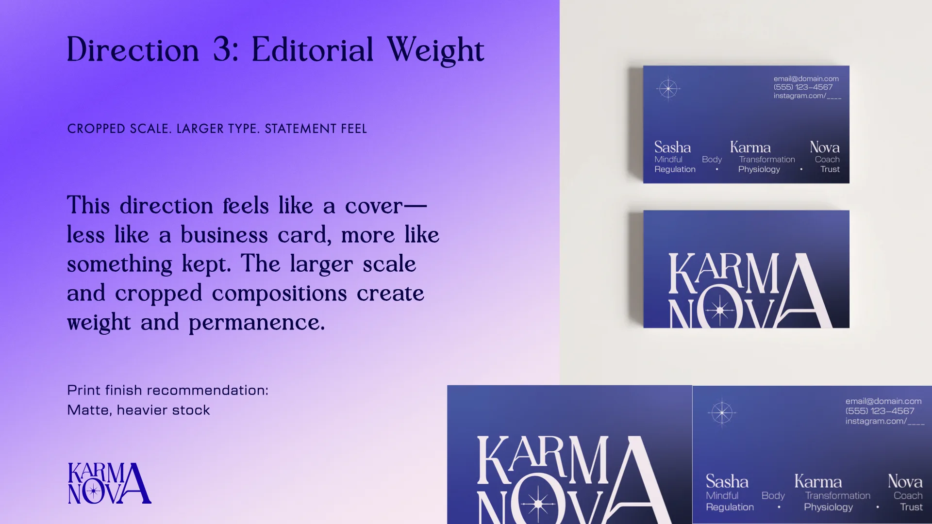
The brand system extended into printed business cards, giving KarmaNova a tangible client touchpoint beyond social content. The collateral helped make the brand feel established, personal, and ready for one-on-one coaching interactions.
A 90-day content system built for trust.
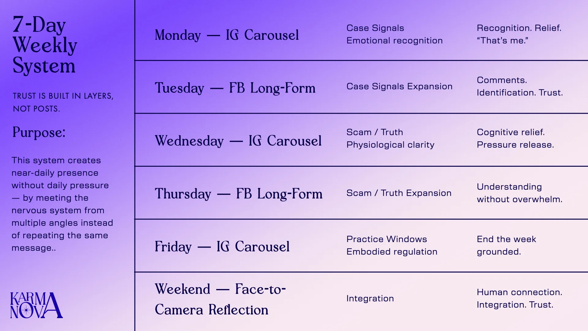
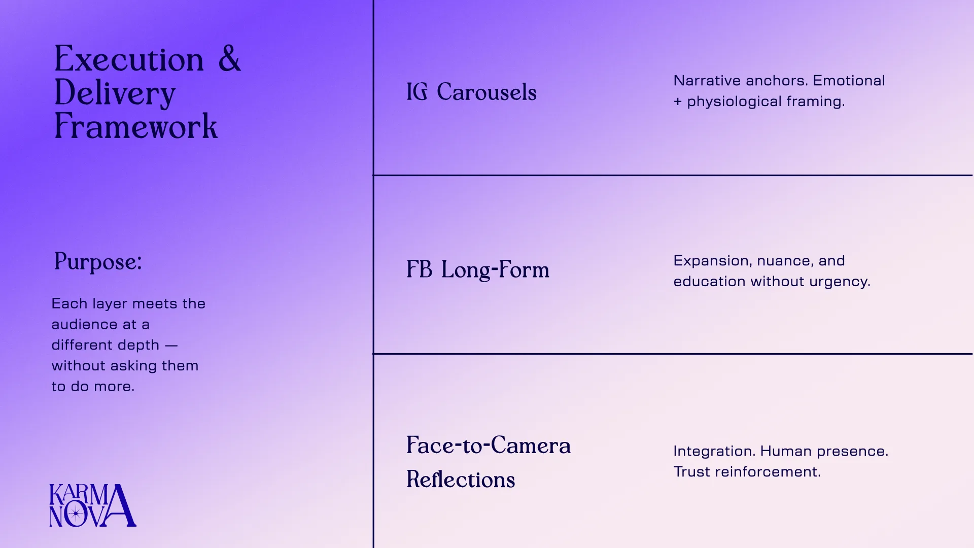
The social system was designed as a long-form brand trust engine. Each week used a four-slide carousel to introduce one idea, reframe it, explain why it matters, and leave the audience with a new way to understand their body or behavior.
Across each month, those weekly carousels built into a larger narrative arc. The system gave KarmaNova a consistent way to educate, reassure, and guide the audience without repeating the same message.
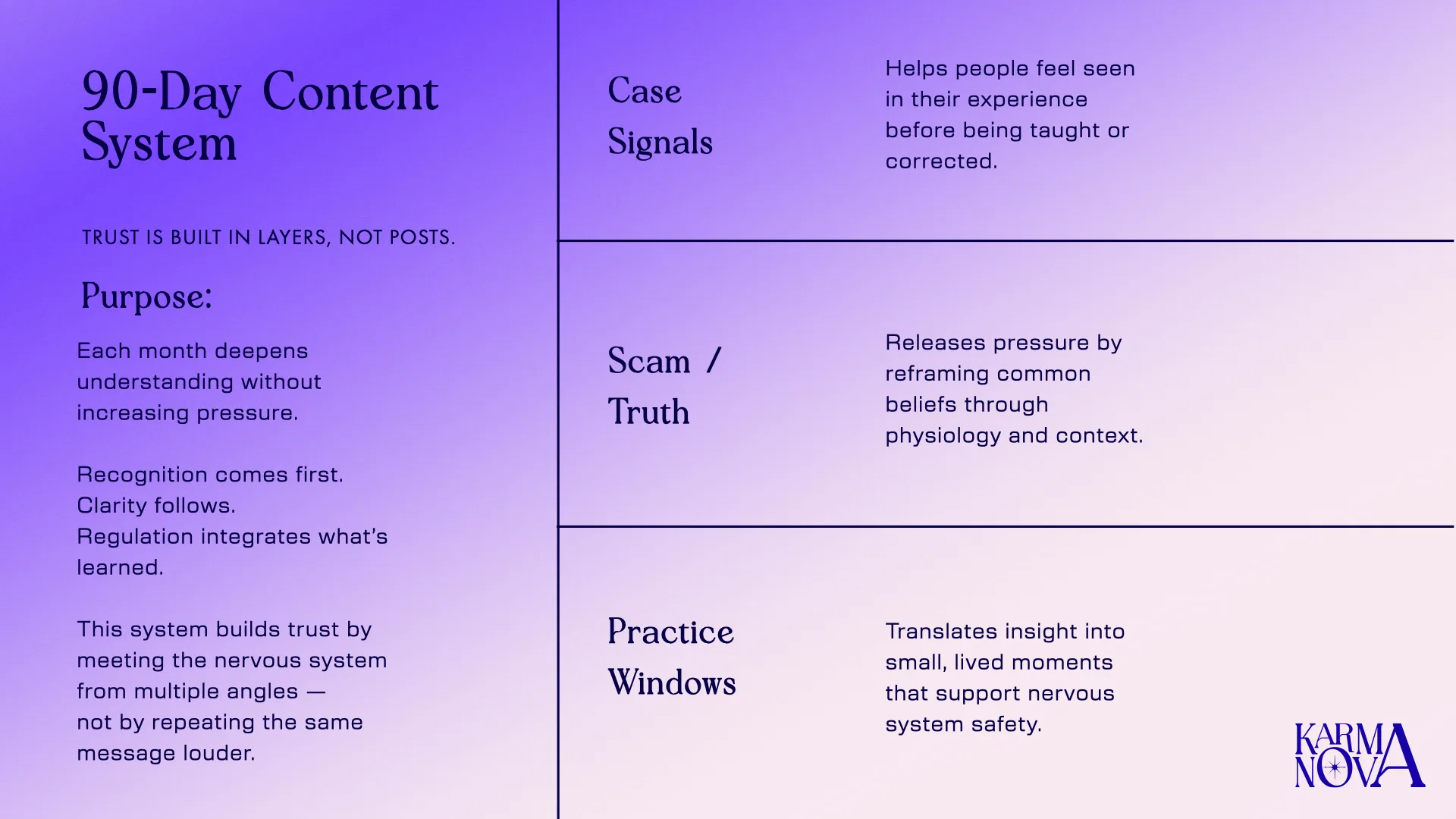
3 content pillars
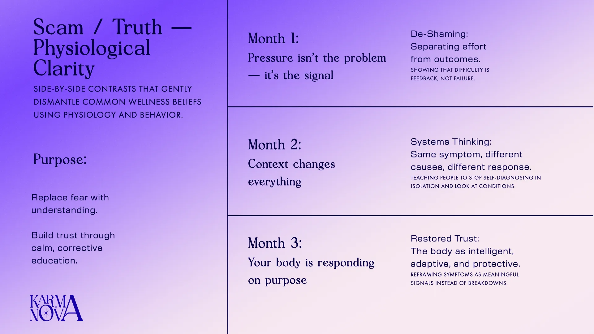
Case Signals / Practice Windows / Scam-Facts
3 months
A 90-day narrative system
4 weeks per month
Each month builds a complete behavioral arc
4 slides per carousel
Each post moves from recognition to meaning
Three pillars, one trust system.
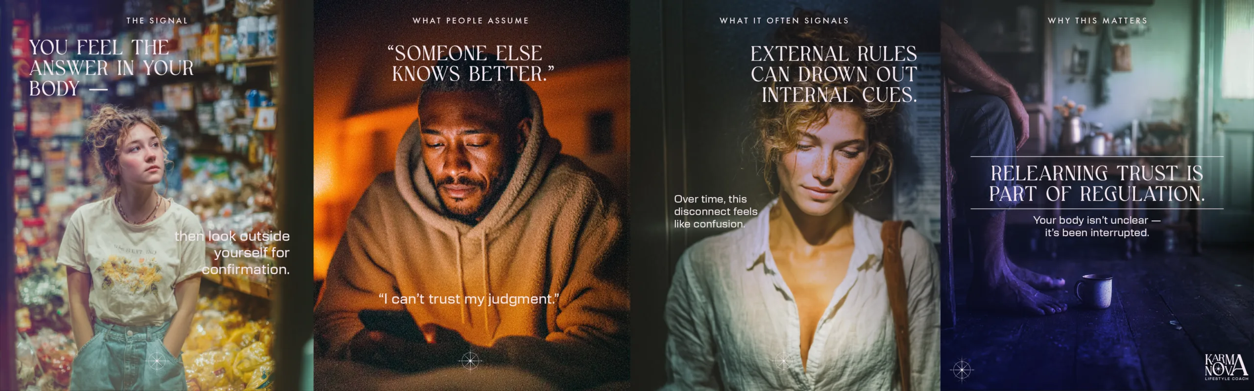
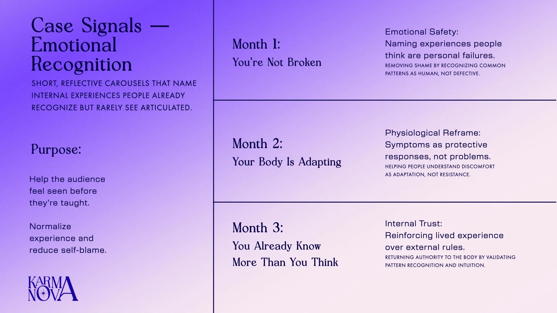
Pillar 1: Case Signals
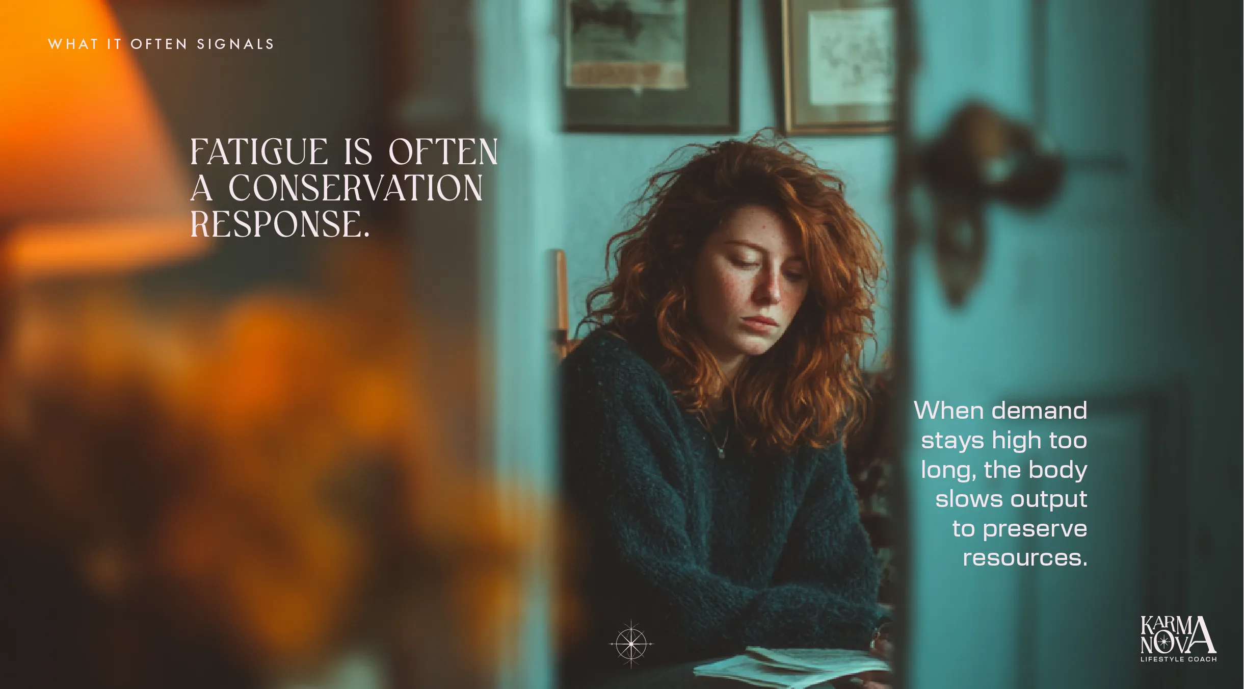
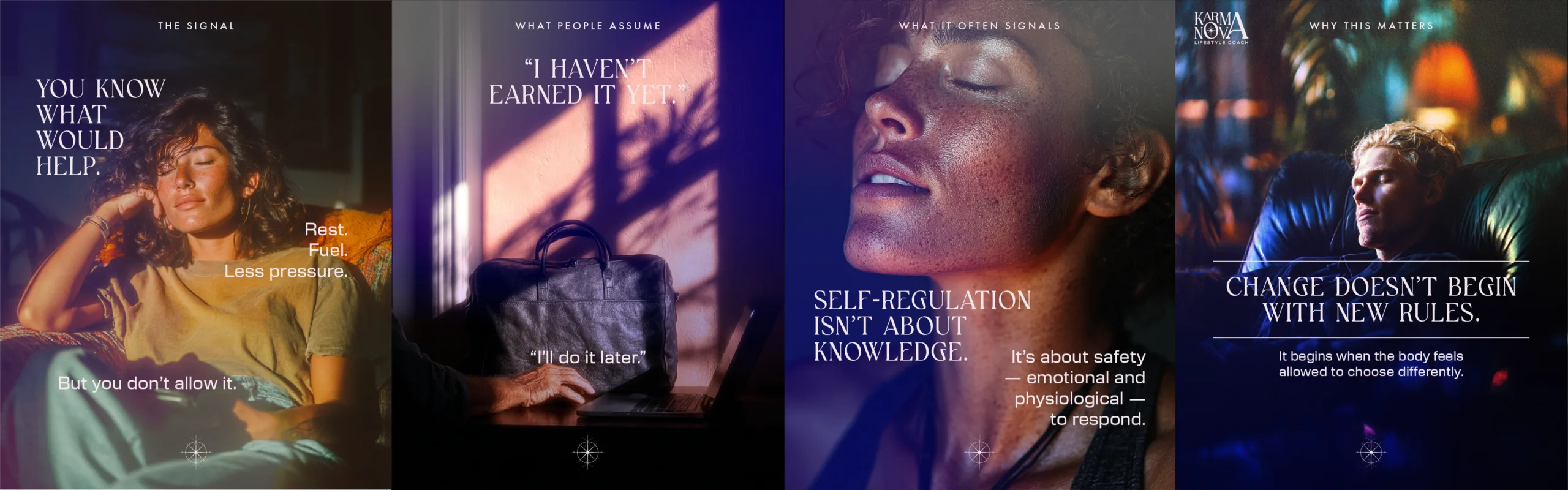
Case Signals helps the audience recognize what their body, habits, and emotions may be communicating. Instead of treating discomfort as failure, the content reframes it as information that can guide the next step.
Purpose:
Build recognition and emotional clarity.
Tone:
Reflective, observant, validating.
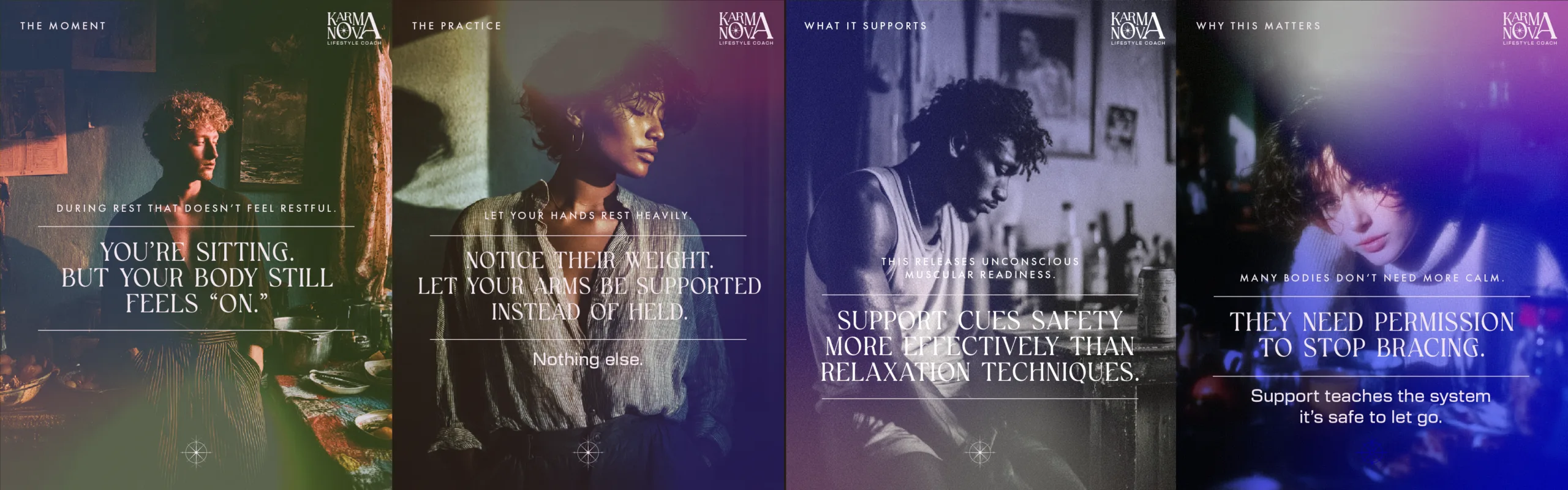
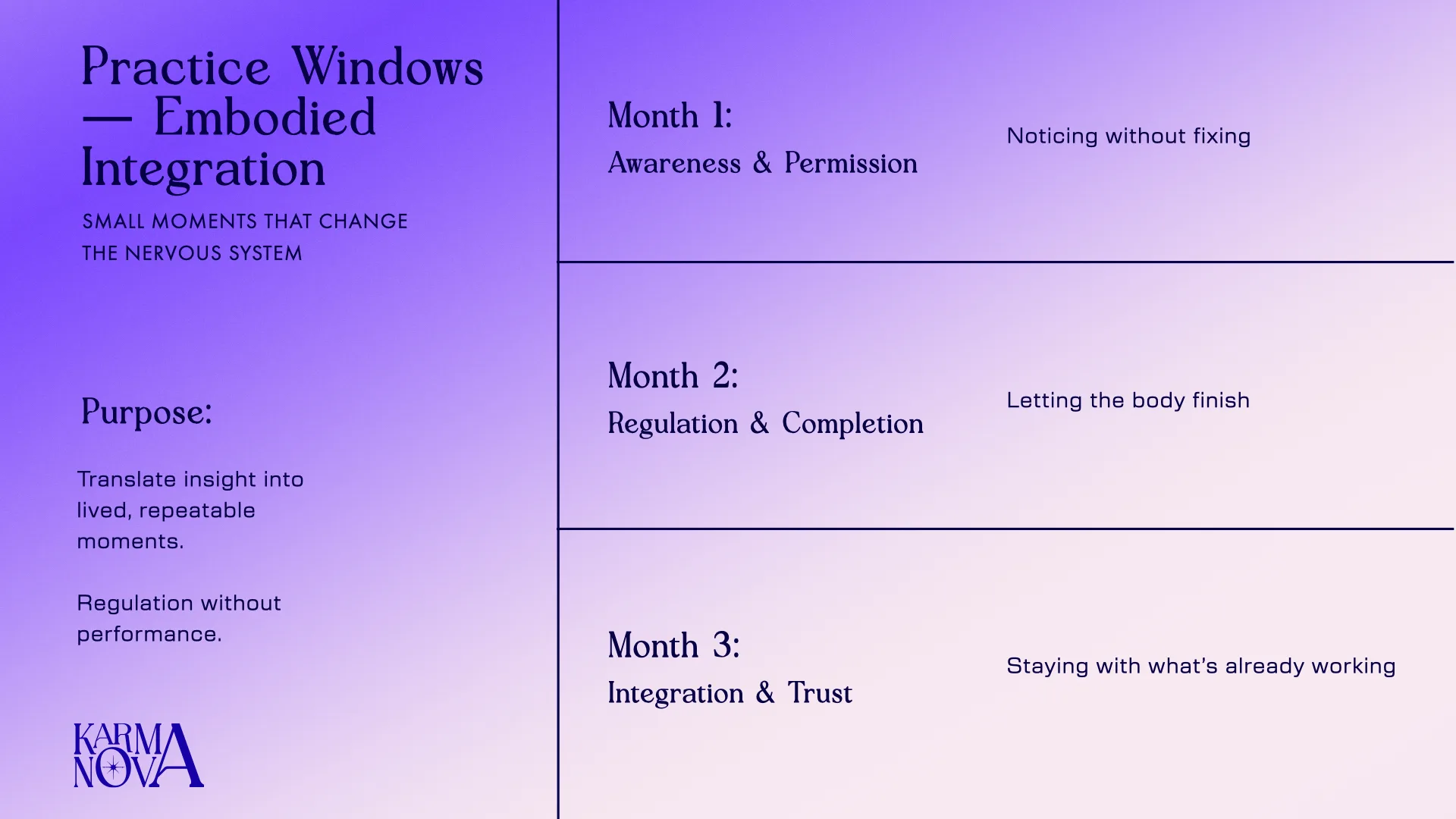
Pillar 2: Practice Windows
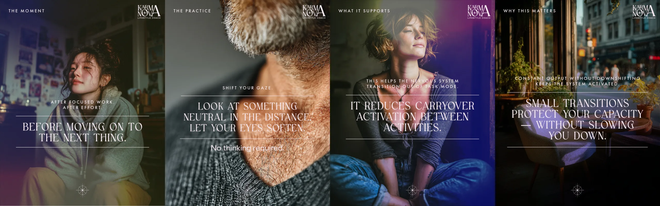
Practice Windows turns insight into small actions. These posts offer simple moments of regulation, reflection, and reset that can fit inside daily life.
Purpose:
Create small, repeatable behavior shifts.
Tone:
Simple, grounded, non-performative.
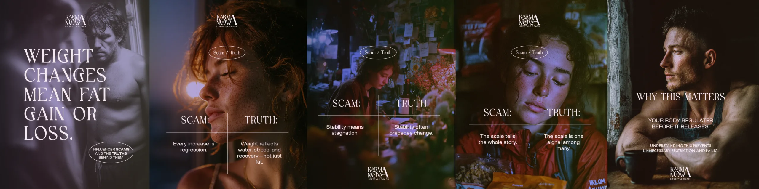
Pillar 3: Scam/Facts
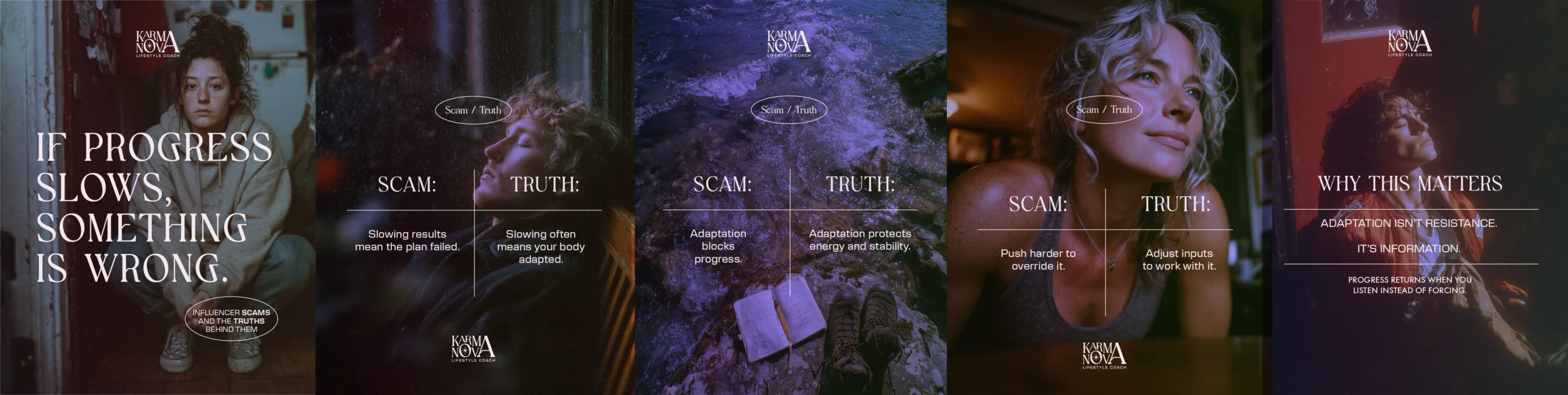
Scam/Facts challenges common wellness myths and replaces them with grounded reframes. The goal is to help the audience question pressure-based beliefs and build a more sustainable relationship with progress.
Purpose:
Replace shame with clarity.
Tone:
Direct, corrective, reassuring.
Each carousel was built as a narrative sequence.
The carousels were structured to move the viewer through a clear emotional and educational arc. Each sequence begins with a belief the audience may already carry, then separates the false assumption from the deeper truth, then explains why the reframe matters.
Slide 1: Recognition
Name the belief or tension the audience already feels.
Slide 2: Contrast
Separate the assumption from the truth.
Slide 3: Reframe
Give the audience a new way to interpret the signal.
Slide 4: Meaning
Explain why the shift matters and how it supports change.
This structure helped the brand teach without sounding clinical, and reassure without sounding vague.
Built to work week by week, month by month.
Each weekly carousel could stand on its own, but the system was designed to compound over time. The month moved from recognition, to reframe, to practice, to integration. That gave KarmaNova a repeatable publishing structure that could support consistency without flattening the brand voice.
Month 1: Establish trust
Month 2: Build behavior awareness
Month 3: Reinforce integration and self-trust
A social feed designed to feel consistent without becoming repetitive.
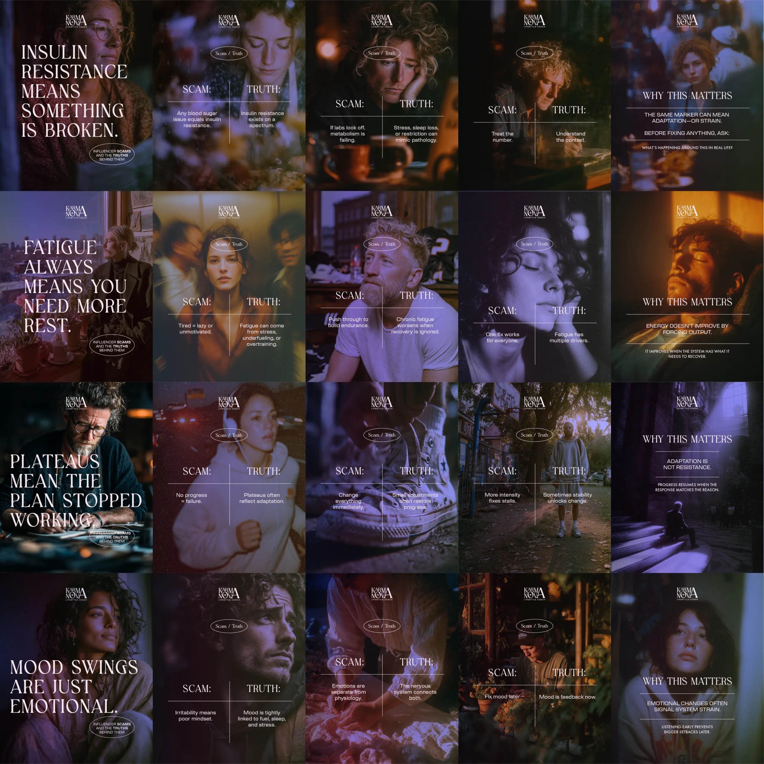
The final system gave KarmaNova a recognizable social language: cinematic imagery, soft gradients, fine-line borders, serif typography, small navigational labels, and direct educational copy. Each pillar had its own rhythm, but the full feed still felt unified.
Imagery
Emotional, cinematic, human-centered.
Typography
Editorial serif headlines paired with functional supporting text.
Slide 3: Reframe
Give the audience a new way to interpret the signal.
Layout
Structured borders, centered statements, slide labels, and recurring logo placement.
Voice
Reflective, corrective, reassuring, and behavior-aware.
From strategy to a working brand system.
The final KarmaNova system connected brand strategy, identity design, messaging, social education, and client collateral. Every part of the system was designed to support the same goal: helping the audience feel seen, guided, and able to build change at a sustainable pace.
A brand system for sustainable transformation.
KarmaNova became more than a wellness identity. It became a trust system: strategy to define the promise, identity to make it recognizable, and content architecture to build belief over time.
KarmaNova Brand Strategy: From Inner Signal to Sustainable Transformation
Share This Story
Brand strategy built to earn trust over time
KarmaNova was built through strategy, identity, messaging, and content architecture. The project began with the brand’s foundation: its essence, positioning, purpose, values, and audience mindsets. From there, the system expanded into visual identity, print collateral, and a 90-day content framework designed to build trust over time. The final brand system gave KarmaNova a way to communicate transformation with clarity, care, and consistency.
More Brand Strategy


The Organism Company (Ginkgo Bioworks Rebrand)
A future-forward identity system blending biotech innovation with timeless storytelling.